|
On a Friday night early last season in Columbus, Ohio, the Canadian television feed of the Leafs-Blue Jackets game zoomed in on a heated discussion between Jared Boll and Dion Phaneuf. As they neared their respective benches, rinkside microphones picked up the following comment from Boll: “Nobody likes you”. That got me thinking: how had Dion Phaneuf fallen so far out of favour? A big, tough, Canadian kid from the Prairies who could hit, shoot and fight, all while being reasonably mobile. If you can find me a more stereotypical (NHL) hockey player, please let me know. So how did a guy with his genetic gifts and skillset, who burst onto the National Hockey League scene with 54 goals in his first three seasons from the back end, and who, according to both Hockey-Reference.com and war-on-ice.com consistently drove possession, become so scorned? Last week’s trade to the Ottawa Senators ended his often-tumultuous stay in Toronto, so let’s have a bit of a post-mortem, shall we? Dion Phaneuf broke in with the Calgary Flames in 2005-06 as a rookie defenceman and promptly put up 20 goals, including 16 on the Power Play. He followed this up with two seasons of 17 goals, and, at the end of 2008-09, his fourth NHL season, had accumulated 65 Goals and 206 Points – first and sixth, respectively, amongst NHL defencemen during that timespan. These impressive offensive numbers were complimented by his reputation for laying bone-crushing hits – that were usually squeaky-clean, I might add. He was submerged deep within a strong Flames defence core which included stalwart, if unspectacular, veterans such as Roman Hamrlík, Robyn Regehr, Cory Sarich and Rhett Warrener, all of whom excelled on the defensive side of the puck. Combine this with the backing of all-world goaltender Mikka Kiprusoff and Dion Phaneuf had full licence to search and destroy, both on the scoresheet and in open ice. Midway through another solid season in 2009-10 season, Phaneuf was dispatched to the Toronto Maple Leafs, who sold him to fans and media alike as a young, defensive stud who would be THE guy on the blueline of the Blue and White for years to come. A mere four months after his arrival, he was named Team Captain, in June of 2010. However, his arrival in Toronto – a infamously tough media market, along with his status as the Number One defenceman AND Captain for one of the most storied hockey franchises the world has ever seen changed Phaneuf – and not for the better. His game was tamer, more conservative. Ron Wilson’s nonsensical requirement that his defencemen keep two hands on their stick (seriously, it was a thing. Look it up.) did not help matters, but clearly, something was amiss. Did he receive pressure from his coach, or perhaps from on high, to tone down his exuberance and play a more responsible game? Did he alter his style of play to ingratiate himself to the notoriously savage Toronto media? Maybe he himself felt that, finally being out of the shadow of his mentors in Calgary and being Toronto’s Captain meant his game had to mature. Only he knows. What I do know is this: his goal-scoring and point production decreased, due in large part to the fact that his once-surgically accurate slapshot began to have trouble splitting the uprights on a football field. His possession numbers for his time in Toronto were brutal. Game-changing hits and end-to-end rushes became few and far between. Having lost the “high-reward” aspects of his play, Phaneuf became merely a “high-risk” player, with defensive coverage that often approached that of the Cheshire Cat. 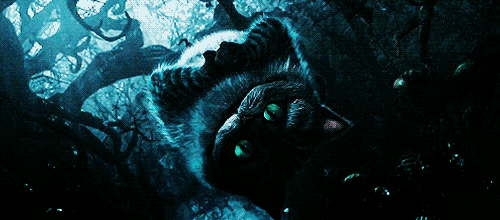 (GIF retrieved from: http://cheshiretime.tumblr.com/post/22138162629/alice-i-dont-want-to-meet-mad-people-cheshire) I argue that this taming of his game exposed Dion Phaneuf for what he is: a good NHL defenceman, comfortable slotting in anywhere from Number Two through Number Four in your rotation. Not, alas, a Number One. I believe that removing the unpredictability from his game actually made Phaneuf a worse player. Opposing wingers once had second thoughts about streaking through the neutral zone, as they knew Phaneuf might just take a chance and step up on them. Now, they had licence to put their heads down and turnstyle him mercilessly. Agitators felt they could push him around because, they knew that he, as the captain, couldn’t risk taking a bad penalty by responding physically. The rollicking, almost improvised style of play that had made Phaneuf a fan-favourite in Calgary – and across the NHL – was also the very thing that once made him so very effective as an NHL defenceman. And it had been beaten out of him, certainly in Toronto, if not also towards the end of his tenure in Calgary.
And you know what? Absolutely none of this is the fault of Dion Phaneuf. He didn’t ask to be traded to Toronto. He didn’t ask to be the Leafs’ Number One defenceman. He didn’t ask to be captain. He didn’t ask to not receive a half-decent supporting cast. And he didn’t offer himself a contract that pays him $7 million per season. Dion Phaneuf is an inherently erratic player. It’s just who he is. He can shoot the puck a million kilometres per hour. He can crush you in open ice or along the boards – take your pick. He can play the Power Play and the Penalty Kill. And for goodness’ sake, don’t fight him; he is one scary dude. His jumping up in the play and stepping up for the big hit can leave fans of his team a little clenched, for sure. However, he is a much more valuable player when the opposing team doesn’t know what the heck he is going to do next. I really hope that Dion Phaneuf, removed from the incredible pressures put on him in Toronto is unleashed in Ottawa and can return to fulfilling his potential. Teach him to pick his spots, sure. But do your best to rekindle some of that old fire.
0 Comments
All illustrations by Andrew M. Greenstein, The unofficial NHL Uniform Database  And now for one that pains me a little. Buffalo is truly the city that just cannot, for the life of them, catch a break. The NFL’s Buffalo Bills made the Super Bowl four consecutive years (1991 through 1994)…and lost each and every one of them. Backstopped by arguably the best goaltender of all time in Dominik Hašek, the Buffalo Sabres had great success in the late ‘90s and early 2000s…but were done in by Brett Hull’s then-illegal Stanley Cup winner and the National Hockey League War Room forgetting that goals are not allowed to count when pucks are shot through the side of the net. The Sabres of 2006 were done in by the idiotic puck-over-the-glass rule, with poor Brian Campbell taking a Delay of Game penalty late in Game Seven of the Eastern Conference Finals, providing the Hurricanes with the powerplay which they used to score the series-winning goal. Then they saw stars like Daniel Brière, Chris Drury, Derek Roy and Ryan Miller all leave town, before losing the 2015 NHL Draft Lottery, despite having the worst overall record. Unfortunately for Sabres players, they also haven’t exactly been provided with the nicest of wearables… 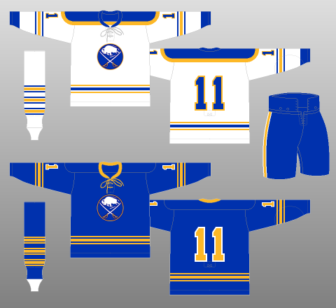 It all started off so well! From their introduction to the NHL in 1970 until the mid-‘90s, the Sabres wore variations of the above uniform. The royal blue and gold colour scheme is timeless, the logo and striping are simple yet interesting, and the lace-up collar – which, sadly, was replaced by a v-neck – is nearly always a good decision. What could possibly go wrong? 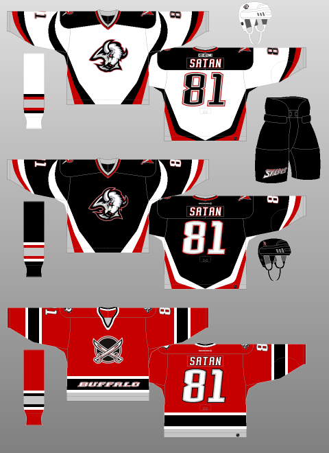 Even the 1996 redesign (which consisted of the black and white kits above; the red came a few years later) was pretty great. It gets a lot of flack for some reason, perhaps because it replaced such a classic set. However, given all of the garbage hanging in NHL locker room stalls during the ‘90s, the Sabres’ stab at modernisation turned out really well. Sharp, angled stripes on the jersey, along with the introduction of a secondary logo on the shoulder, make it pretty clear that the Sabres are indeed named after a pretty serious weapon. The central logo, a buffalo’s head, symbolises their fair city – or at least its name (I will confess, though: I had a poster of Hašek in my bedroom throughout my childhood. It was only in my early 20s that I realised that the mouth of the buffalo was on the right, and not the left). The late-coming third kit, including the red, “dinner plate” jerseys – that say “BUFFALO” on the waist striping, just in case you forgot who was playing and decided to check out some crotches to find out – were an ill-advised departure from the formula, to be sure. But, overall, these very-‘90s uniforms were – and still are – thoroughly enjoyable. One of the few attempts at modernisation that resulted in success. Enter the Buffaslug. 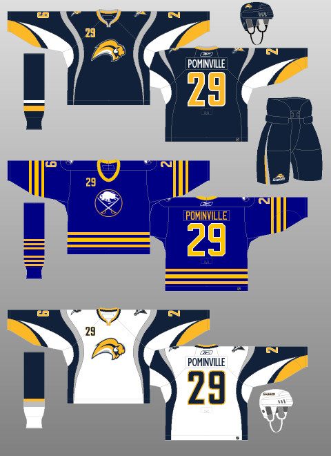 Oh…oh dear. A tiny, limbless, possibly demonic – check out those red eyes – buffalo flanked by a drab colour scheme – since when does the colour grey brighten up anyone’s day? – and psychedelic striping. Thankfully, the team threw their fans a bone with a throwback third jersey…which they promptly removed from their wardrobe the following season. The Buffaslug jersey is truly one of the most revolting articles of clothing the world has ever known. The following two kits followed the Buffaslug, with the Home and Away kits enduring to the present day. I included them purely to bring to the attention of the world that the middle jersey in each picture was actually worn by a professional hockey team, by players making millions of dollars. 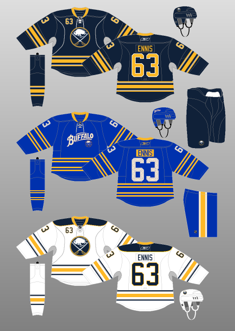 The first one puts some neat striping and accent variations on the Sabres’ original uniform sets…before making the logo the size of a dime and writing “BUFFALO” across the front in what looks like WordArt. I’m not a fan of script logos in general – why tell your fans what they already know? – but they are especially tacky when they dwarf the team’s original logo on the team’s original(-ish) backdrop. Yes, I know the script logo paid homage to the AHL’s Buffalo Bisons of the mid-20th Century, but did it really have to be front and centre? Why not pop it on the shoulder? The yellow nameplates contrast well with the royal blue of the jerseys, and the quilted numbers are kinda neat. I might even be able to get used to the 2 x 2 striping on the jerseys and socks. But the logo just ruins it for me. 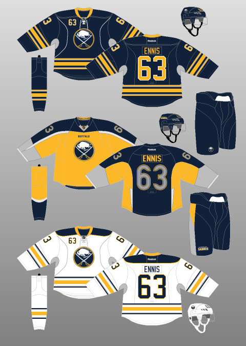 And the second one… Well, the Sabres’ own President, Ted Black, publicly stated after it was released that it might just be a “turd burger”. It looks like one of those paint-by-numbers pictures gone horribly awry, like someone whose friends have drawn on him/her after he/she passed out at a party. Millions of television sets found themselves prematurely discarded after hockey fans couldn’t understand why there was so much grey on their screens. Looking at it from the front (yellow) and back (blue), one would be hard-pressed to identify it as the same jersey. It looks like the wearing has donned a cape and is about to fly off into the night, perhaps to fight all of the Canadians coming across the border to clean out Buffalo’s malls. Oh but hey now, it’s not all bad: it says “BUFFALO” in tiny letters on the front. Just in case you forgot. I mean, how thoughtful is that?! 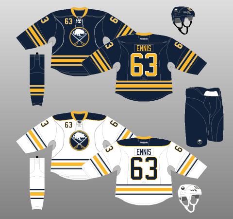 Which brings us to the present day. The Home kit was first introduced during the Buffaslug era as an alternate uniform. In 2010, it became their official Home uniform, while a white variation was added for the Away. The overall design is similar to that of their inaugural season, albeit with thicker striping on the jerseys and simplified striping on the socks – one batch of three stripes, instead of a Leafs-esque 3 x 3. The Sabres have chosen to stick with Reebok Edge ideals with the addition of “silver” (grey?) vertical piping on the sweaters. That said, this design choice is innocuous enough not to ruin the jerseys altogether. Equally odd are the player numbers on the top-left of the jersey (or the top-right if you’re wearing one right now). A holdover from the Buffaslug days, they break up the cleanliness of the look, though they are not particularly offensive to the eye.
The colour scheme retains the gold of the originals, but shifts from royal blue to navy. NHL teams have, generally, a pretty brutal history of creating dark-themed jerseys (Dallas, anyone? How about Anaheim? Buffalo, however, has pulled this one off rather nicely. The gold accents are bright and bold enough to offset the darkening, though a vertical gold stripe on the pants – and perhaps a gold shoulder outline on the Home jerseys, such as the accenting on Carolina’s old duds – would be welcome. Overall though, it is a pretty simple, relatively clean design. No shoulder logo? No problem. Buffalo has really done right by their fans and oh wait what was that… For the love of all things good and pure, STOP WITH THE GREY. And you put it under the arms (and neck), to boot! Now it just looks like your players are sweating all over the joint. Maybe that’s why your team doesn’t score, none of your players want to raise their arms! Since when does grey ever make anything better?! Sabres fans… I’m sorry. I’m just so sorry. |
Peter FerrellThis is a hockey blog. CategoriesArchives
September 2016
|
 RSS Feed
