|
My sincerest thanks goes out to Andrew M. Greenstein, The unofficial NHL Uniform Database, Chris Creamer’s SportsLogos.Net and Mike Lessiter’s “The Names of the Games” (Lessiter, M. [1988]. The names of the game: The stories behind the nicknames of 102 pro football, basketball, baseball, and hockey teams. Markham: Beaverbooks [Chicago: Contemporary Books]). Much has been made recently about the desire to change the names of sports teams carrying Aboriginal-related monikers to more politically-correct, socially-acceptable nicknames. Well, to be fair, the notion has likely been around for decades, but the omnipresence of the Internet has made both the expression and the dissemination of the idea significantly easier. Add to this the increasing willingness amongst governments to delve into the history of their tumultuous, often-shameful relations with Aboriginal communities – and acknowledge and apologise for the litany of wrongdoings – and the conditions are optimal for a frank societal discussion in North America over what we want our sports teams to represent.
Let’s pause on that word for a moment: “discussion”. It seems as though any representation of Aboriginals within the context of sports is increasingly seen as automatically offensive. I am not Aboriginal, nor am I of Aboriginal descent. I do not have any conception of what it is like to have my culture, language and values – and or of my ancestors – torn from me and scattered to the winds. And I do not have any conception of what it is like to have this tragic chapter of my ancestry relegated to an aside in a grade school textbook. Thus, I can confidently state that I am not the best person to be writing about this. However, I do bring an outsider’s perspective to the issue, a perspective influenced neither by cultural history nor team fandom. So, with that all said, let’s take a look at Aboriginal team names from the four major North American professional sports leagues: MLB Atlanta Braves BACKGROUND: According to Mike Lessiter’s The Names of the Games, the “Braves” name came about in 1911 – following several name changes for the then Boston-based franchise – due to new team owner James E. Gaffney having a reputation as a “brave” on the political scene. The team eventually moved on to Milwaukee and, finally, settled in Atlanta, retaining the Braves name. Early logos were certainly stereotypical and the move to Milwaukee arguably worsened this condition. Only in 1990 did the franchise finally settle on something more palatable. MY VIEW: A “brave” is defined by Merriam-Webster as a warrior of an Aboriginal group. The current logo is a tomahawk, a traditional Aboriginal tool and weapon. Though the past iterations of the logo are bad enough to make even the most iron-stomached among us nauseous, from the outside, there seems to be nothing explicitly wrong with the team’s current brand. But for the love of all that is good and pure Atlanta, knock it off with the “Fear the Chop” garbage. Seriously. We get that your logo is a tomahawk, but the music takes an already borderline tradition and drives it full speed into Wrong-Side-of-History Gorge. Cleveland Indians BACKGROUND: The Names of the Games cites Louis Francis Sockalexis as the inspiration for Cleveland’s moniker, who was, apparently, the first person of Aboriginal descent to play in the major leagues (this distinction is contested). Sockalexis played with the team for three seasons in the early 1900s. In 1915, shortly after his passing, the Cleveland franchise renamed their team the “Indians” as a tribute, though there is not universal agreement on this point. The early logo history is abysmal, a condition that only worsened after the introduction of “Chief Wahoo” in 1946. Though the primary logo is currently a stylised “C”, Chief Wahoo has been retained as the team’s secondary emblem. Ironically, the Indians play at “Progressive Field”. MY VIEW: No contest; get rid of it. The name, tribute or not, is no longer acceptable. Not only is it factually inaccurate, it is so generic as a representation of Aboriginals as to be downright insulting. The logo worsens things exponentially, with its exaggerated display of Aboriginal stereotypes. Perhaps consultation with Aboriginal groups in the area is in order to find a new name that pays proper tribute to the region’s history (the Florida State Seminoles is one such example). If that doesn’t work, there is always the franchise’s original “Forest Citys” name to fall back upon. NBA Golden State Warriors BACKGROUND: The Warriors take their team name from the Philadelphia Warriors of the old American Basketball League. The team only lasted for two seasons, before being resurrected in 1946 for the Basketball Association of America. “Warriors” is a pretty generic name which can represent the subsections of nearly every society that defend said societies. But good gracious, that logo… Nahhh it’s okay though, that logo disappeared in 1962 and everything was fine after that. Okay, really now, third time’s the charm. OH COME ON. MY VIEW: Nothing wrong with the name. However, given the unfortunate history of the name’s representation – that of exceedingly stereotypical depictions of Aboriginals, the Warriors should think about a less-generic logo for their current uniforms to emphasise the fact that their moniker has truly moved away from its troubled past. Besides, the current logo isn’t all that exciting and would probably function better in a secondary role anyway. The NFL Kansas City Chiefs BACKGROUND: According to SB Nation blog Arrowhead Pride, former Kansas City Mayor H. Roe Bartle earned the nickname, “The Chief” on account of his work with the Aboriginal communities, and his nickname was the most-submitted entry in the contest to name the relocated Dallas Texans of the American Football League. The early logo was a stereotypical gongshow but, since 1972, it has been a simple arrowhead. Of course, arrowheads are a constant within the history of many cultures, but it isn’t Chief Wahoo so we’ll just gloss over that. MY VIEW: Oh good, they do it too! -___- Come on, Kansas City. It’s a bad tradition to begin with, but you also stole it from the Atlanta Braves…who apparently stole it from the Florida State Seminoles. Anyway. The name comes from a good place and the logo is stereotypical but pretty tame. Few problems here. Washington Redskins BACKGROUND: The Redskins were named as such due to their one-time tenancy at Boston’s Fenway Park, home of the Red Sox. However, since 1937, the team has been located in Washington, D.C., removing any legitimacy for their clearly insensitive team name. Prior to becoming the Redskins, the franchise was known as the Braves (passable) and the Eskimos (also abhorrent), so questionable names have been around since the beginning. Add to this the fact that their primary colour can be interpreted to represent stereotypical interpretations of Aboriginal skin tones and you’ve got yourself the strongest argument of the bunch for a total team branding revamp. MY VIEW: The worst of the worst. Owner Dan Snyder’s claims that the name is “a badge of honor” were debunked in 1933. The logo appears to represent no person in particular and the colour scheme is questionable at best. Blackskins, Whiteskins and Yellowskins would all be grossly inappropriate. So why is Redskins allowed to stand? The NHL Chicago Blackhawks BACKGROUND: The team is named for a World War One unit that was named after Chief Black Hawk of the Sauk Nation, who stood up for his tribe against the strong-armed tactics of the United States Government and its constant desire for expansion. The logos have remained fairly consistent over time – the primary emblem is a headshot portrait of an Aboriginal and the secondary is two tomahawks crossing over a stylised “C”. MY VIEW: So we’ve got the name of a legendary Aboriginal leader. That’s a pretty good start; I feel like, if a team really feels compelled to to utilise an Aboriginal-themed moniker, then it is good practice to choose a specific element of Aboriginal culture – whether that be a given tribe, position, role model or artefact – to draw from. The primary logo is a somewhat stereotypical, though admittedly neutral, image of an Aboriginal (The Names of the Games indicates that this portrait is a depiction of Chief Black Hawk, though Internet sources give mixed indications, with The (unofficial) NHL Uniform Database and Chris Creamer’s SportsLogos.Net both not indicating as such). The Blackhawks get a pass from me, though, should they indeed decide to change their logo, there is already a pretty solid alternative ready to go. In conclusion, I mean no offense and no harm by this article. They are simply my observations as an outside observer that is neither a fan of any of the above teams nor someone of Aboriginal descent. North American society can’t shy away from discussions about our troubled past – and present. For instance, I think we can all support the alteration of history curriculums to encompass the history of Canada and the United States as a temporal whole, rather than simply focussing on the European perspective of what happened after Europeans landed on North American shores. On the other hand, we also have to be aware of the fact that some people of Aboriginal ancestry are not bothered by this debate at all. In terms of sports, we cannot let maniacs like Dan Snyder continue doing what they’re doing. And yet, it is not prudent to just delete any and all references to Aboriginal culture from our sporting teams. If we do, where do we stop? If some people of Scandinavian descent are offended by the Minnesota Vikings, and their logo and mascot, are we going to change their name, too? No, that’s ridiculous. The vast majority of people can distinguish between the Viking propensity for ferocious warfare and the Scandinavian people as a whole. Now, if the team were named the Minnesota Whiteskins, it might be a different story. In the same way, I would imagine that most people know that the name “Braves” represents a small part of historical Aboriginal society, and is not reflective of Aboriginal people as a whole. Clearly, balance is needed. TL;DR? We should be wary of painting things with too broad a brush. At the same time, we should not refuse to acknowledge that a brush exists at all.
0 Comments
All illustrations by Andrew M. Greenstein, The unofficial NHL Uniform Database 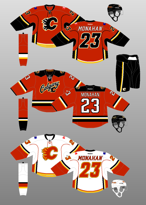 Ahhh yes, the Calgary Flames. My hometown team. My boys! The perennial feel-good, hard-working, grab-your-lunch-pail-and-work-boots-and-go-to-work team…that has also won only 4 playoff rounds since 1989, missing the playoffs altogether 13 times during that span. Well, hey, at least they don’t consistently keep trading my favourite players though, right?! I’m so happy Theo Fleury spent his entire caree–…I mean, isn’t it wonderful that Valeri Bure got to retire as a Fl–…you’ve gotta be kidding me, what about Freddie Brathwaite? ...well, SURELY Jarome Iginla won’t be trad–OH COME ON. Fuck it. At least they have nice jerseys. OH WAIT. But, for now, let’s head back to happier times, where it all began: 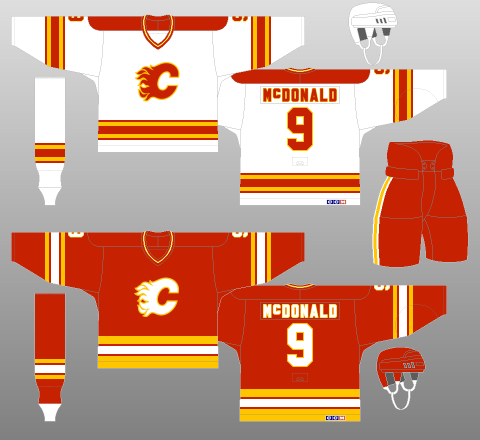 Yes, the ‘80s. Fresh off a move from Atlanta, the Flames were kicking ass and taking names. Or, rather, providing a mild divisional annoyance to the Edmonton Oilers during the latter team’s march to 64 Cups in the decade. Nevertheless, they looked sharp doing it, with a simple, three-colour design – extracted from Lanny McDonald’s glorious moustache – that was bright enough to belong in the 1980s, yet timeless enough to be brought back as a throwback in 2009 – 20 years after their lone Stanley Cup win. However, after experiencing four first-round exits in five years – the other year being one in which they failed to qualify for the Playoffs at all, it was clear that something needed to be done. Of course, what shakes a team up more than new jerseys, amirite?! 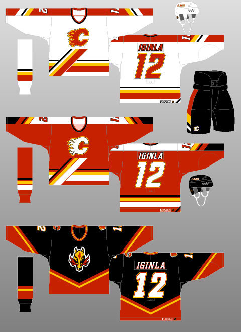 Well, to be brutally honest, it didn’t work. I feel like trading away superstar – and Stanley Cup winning goal-scorer – Doug Gilmour for…well, not Doug Gilmour might also have had something to do with that. The Flames would not win a Playoff round until 2004 – wearing another kit, I might add. However, this 1994 effort at redesigning the Home and Away uniforms – which were joined by a black Alternate kit in 1998 – wasn’t too shabby, especially considering some of the garbage being spewed out by other teams of the era. The addition of black was done tastefully to the Home and Away jerseys, and the diagonal platform that the logo rests upon – along with corresponding trim on the jersey sleeves and pants – is interesting and breaks up what would otherwise be a pretty, yet dull, concoction. The black, “Flaming Horse” jersey took a lot of heat (see what I did there?!), especially when they usurped the red jerseys as Calgary’s Away uniforms in the next redesign, but I didn’t mind it – Calgary IS the “Stampede City”, after all – though the white fill for the numbers and font probably should have been red. At the very least, the logo was well-suited to the secondary status it enjoyed in the next iteration of the Flames’ duds. One final point is the fact that, in one of the best uniform-related decisions in NHL history, the Flames Alternate Captains, instead of the traditional “A” on their jerseys, had the stylised “A” logo of Calgary’s predecessors, the Atlanta Flames, on their chests. How cool is that! They even briefly tried their primary logo as the patch for the Captain, but that change did not last. 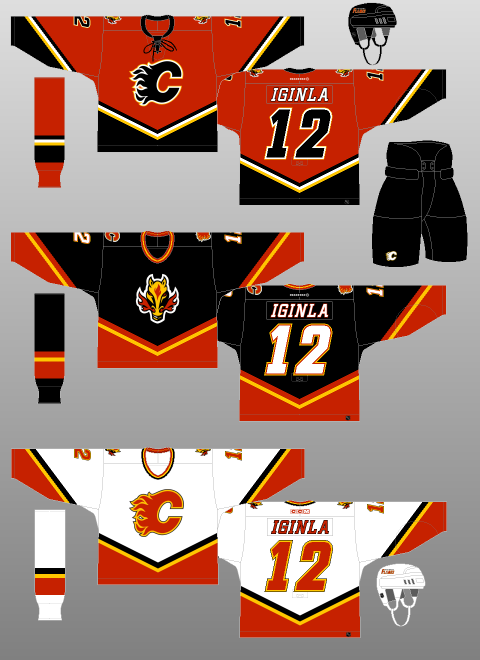 The white jersey you see above was introduced to start the 2000-01 season, while the red one was added in 2003 – when the NHL switched back to having dark-coloured Home and light-coloured Away jerseys. Both follow the template of the “Flaming Horse” jersey, with said logo relegated to secondary status on the shoulder. As neat as it is, the Flames’ actual logo is dope. Why they didn’t just put their primary logo on the black jersey is beyond me. But I digress. The black crest on the red jersey was a first for the team and still looks phenomenal today. Not that the white Flaming C was bad, but the black just looks a little bit more menacing. Plus, they went to Game Seven of the Stanley Cup Final with these jerseys (although they probably should have been awarded the Cup in Game Six. Here’s a video of it. Not that I’m bitter or anything.) They even added a lace-up neck! Ticks all my boxes, this one. Which brings us to the present day. Oh…oh dear.  Introduced for the 2007-08 season, the Reebok Edge uniform system, with its unfinished sleeve striping, emphasis on vertical patterns over the horizontal, and weird fixation on figure-hugging vertical piping made a mockery of many a beautiful jersey. And then there was the scandal where Reebok flat-out forgot to design the Maple Leafs a uniform at all, leaving them with nothing to wear but practice jerseys.
But perhaps no team was so dearly affected by this mass redesign than the Calgary Flames. Weird, incomplete sleeve stripes. Weird, incomplete underarm stripes. Weird, incomplete piping that leads to nowhere, A weird, horizontal tail stripe that intersects with the vertical underarm striping like it was designed in Microsoft Paint. Et la pièce de résistance? The flag of Alberta on one shoulder, with the flag of Canada on the other. Just in case you forgot where Calgary was. At least the Canadian flag blends in; the Alberta flag’s blue background contrasts completely with the team’s colour scheme. It looks like one of those crafts from elementary school that you had to make by sticking bits of recycling together. In 2013, the dumpster fire burned on with the introduction of a new Alternate kit, seen in the middle of the above image. A tiny collegiate-like script, complimented by a tiny Flames logo is the primary crest. The secondary logo is too complicated for its own good, not to mention the fact that the “F” of the “CF” mark points directly into the ground. Logos are supposed to be something that a kid can draw in school. Not that have to be explained to them by their parents. Perhaps even more bizarrely, the round secondary logo and the curvy, rounded primary crest(s?) contrast sharply with the squared-off shoulder yokes, and squared-off, incomplete striping. What a mess. Other than the brief blip in 2004, following this team has been one disappointment after another. Yes, yes, there was the Spring of 2015. But, in our heart of hearts, we Flames fans knew that our team was playing way above its heads – not to mention way above the Law of Averages. That said, after many years in the wilderness, the Flames appear to finally be on the rebound. Now we we wait for the day that they get a jersey that we can wear in public without being arrested for indecent exposure. |
Peter FerrellThis is a hockey blog. CategoriesArchives
September 2016
|
 RSS Feed
