|
All illustrations by Andrew M. Greenstein, The unofficial NHL Uniform Database 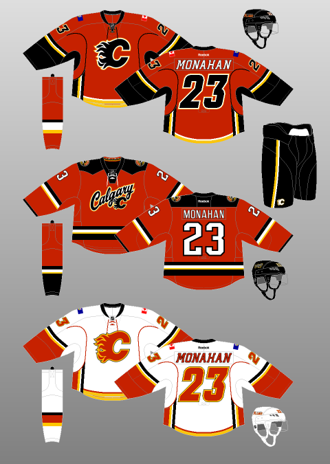 Ahhh yes, the Calgary Flames. My hometown team. My boys! The perennial feel-good, hard-working, grab-your-lunch-pail-and-work-boots-and-go-to-work team…that has also won only 4 playoff rounds since 1989, missing the playoffs altogether 13 times during that span. Well, hey, at least they don’t consistently keep trading my favourite players though, right?! I’m so happy Theo Fleury spent his entire caree–…I mean, isn’t it wonderful that Valeri Bure got to retire as a Fl–…you’ve gotta be kidding me, what about Freddie Brathwaite? ...well, SURELY Jarome Iginla won’t be trad–OH COME ON. Fuck it. At least they have nice jerseys. OH WAIT. But, for now, let’s head back to happier times, where it all began: 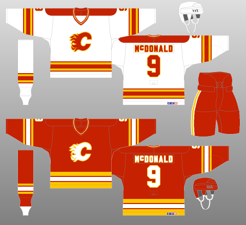 Yes, the ‘80s. Fresh off a move from Atlanta, the Flames were kicking ass and taking names. Or, rather, providing a mild divisional annoyance to the Edmonton Oilers during the latter team’s march to 64 Cups in the decade. Nevertheless, they looked sharp doing it, with a simple, three-colour design – extracted from Lanny McDonald’s glorious moustache – that was bright enough to belong in the 1980s, yet timeless enough to be brought back as a throwback in 2009 – 20 years after their lone Stanley Cup win. However, after experiencing four first-round exits in five years – the other year being one in which they failed to qualify for the Playoffs at all, it was clear that something needed to be done. Of course, what shakes a team up more than new jerseys, amirite?! 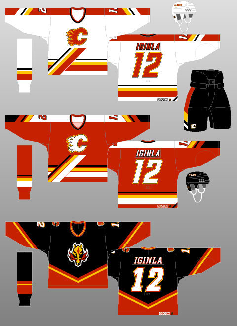 Well, to be brutally honest, it didn’t work. I feel like trading away superstar – and Stanley Cup winning goal-scorer – Doug Gilmour for…well, not Doug Gilmour might also have had something to do with that. The Flames would not win a Playoff round until 2004 – wearing another kit, I might add. However, this 1994 effort at redesigning the Home and Away uniforms – which were joined by a black Alternate kit in 1998 – wasn’t too shabby, especially considering some of the garbage being spewed out by other teams of the era. The addition of black was done tastefully to the Home and Away jerseys, and the diagonal platform that the logo rests upon – along with corresponding trim on the jersey sleeves and pants – is interesting and breaks up what would otherwise be a pretty, yet dull, concoction. The black, “Flaming Horse” jersey took a lot of heat (see what I did there?!), especially when they usurped the red jerseys as Calgary’s Away uniforms in the next redesign, but I didn’t mind it – Calgary IS the “Stampede City”, after all – though the white fill for the numbers and font probably should have been red. At the very least, the logo was well-suited to the secondary status it enjoyed in the next iteration of the Flames’ duds. One final point is the fact that, in one of the best uniform-related decisions in NHL history, the Flames Alternate Captains, instead of the traditional “A” on their jerseys, had the stylised “A” logo of Calgary’s predecessors, the Atlanta Flames, on their chests. How cool is that! They even briefly tried their primary logo as the patch for the Captain, but that change did not last. 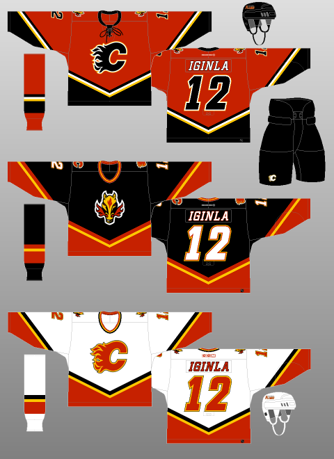 The white jersey you see above was introduced to start the 2000-01 season, while the red one was added in 2003 – when the NHL switched back to having dark-coloured Home and light-coloured Away jerseys. Both follow the template of the “Flaming Horse” jersey, with said logo relegated to secondary status on the shoulder. As neat as it is, the Flames’ actual logo is dope. Why they didn’t just put their primary logo on the black jersey is beyond me. But I digress. The black crest on the red jersey was a first for the team and still looks phenomenal today. Not that the white Flaming C was bad, but the black just looks a little bit more menacing. Plus, they went to Game Seven of the Stanley Cup Final with these jerseys (although they probably should have been awarded the Cup in Game Six. Here’s a video of it. Not that I’m bitter or anything.) They even added a lace-up neck! Ticks all my boxes, this one. Which brings us to the present day. Oh…oh dear.  Introduced for the 2007-08 season, the Reebok Edge uniform system, with its unfinished sleeve striping, emphasis on vertical patterns over the horizontal, and weird fixation on figure-hugging vertical piping made a mockery of many a beautiful jersey. And then there was the scandal where Reebok flat-out forgot to design the Maple Leafs a uniform at all, leaving them with nothing to wear but practice jerseys.
But perhaps no team was so dearly affected by this mass redesign than the Calgary Flames. Weird, incomplete sleeve stripes. Weird, incomplete underarm stripes. Weird, incomplete piping that leads to nowhere, A weird, horizontal tail stripe that intersects with the vertical underarm striping like it was designed in Microsoft Paint. Et la pièce de résistance? The flag of Alberta on one shoulder, with the flag of Canada on the other. Just in case you forgot where Calgary was. At least the Canadian flag blends in; the Alberta flag’s blue background contrasts completely with the team’s colour scheme. It looks like one of those crafts from elementary school that you had to make by sticking bits of recycling together. In 2013, the dumpster fire burned on with the introduction of a new Alternate kit, seen in the middle of the above image. A tiny collegiate-like script, complimented by a tiny Flames logo is the primary crest. The secondary logo is too complicated for its own good, not to mention the fact that the “F” of the “CF” mark points directly into the ground. Logos are supposed to be something that a kid can draw in school. Not that have to be explained to them by their parents. Perhaps even more bizarrely, the round secondary logo and the curvy, rounded primary crest(s?) contrast sharply with the squared-off shoulder yokes, and squared-off, incomplete striping. What a mess. Other than the brief blip in 2004, following this team has been one disappointment after another. Yes, yes, there was the Spring of 2015. But, in our heart of hearts, we Flames fans knew that our team was playing way above its heads – not to mention way above the Law of Averages. That said, after many years in the wilderness, the Flames appear to finally be on the rebound. Now we we wait for the day that they get a jersey that we can wear in public without being arrested for indecent exposure.
0 Comments
All illustrations by Andrew M. Greenstein, The unofficial NHL Uniform Database  And now for one that pains me a little. Buffalo is truly the city that just cannot, for the life of them, catch a break. The NFL’s Buffalo Bills made the Super Bowl four consecutive years (1991 through 1994)…and lost each and every one of them. Backstopped by arguably the best goaltender of all time in Dominik Hašek, the Buffalo Sabres had great success in the late ‘90s and early 2000s…but were done in by Brett Hull’s then-illegal Stanley Cup winner and the National Hockey League War Room forgetting that goals are not allowed to count when pucks are shot through the side of the net. The Sabres of 2006 were done in by the idiotic puck-over-the-glass rule, with poor Brian Campbell taking a Delay of Game penalty late in Game Seven of the Eastern Conference Finals, providing the Hurricanes with the powerplay which they used to score the series-winning goal. Then they saw stars like Daniel Brière, Chris Drury, Derek Roy and Ryan Miller all leave town, before losing the 2015 NHL Draft Lottery, despite having the worst overall record. Unfortunately for Sabres players, they also haven’t exactly been provided with the nicest of wearables… 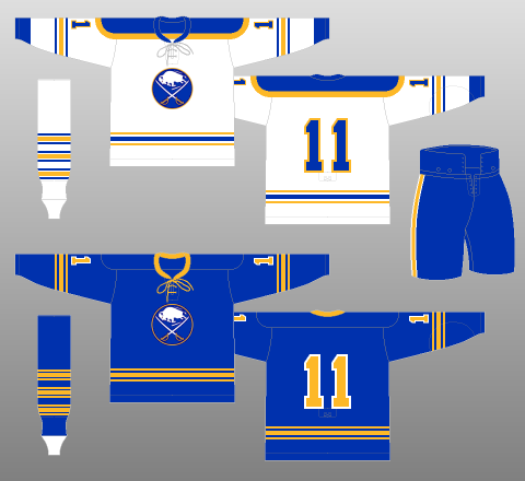 It all started off so well! From their introduction to the NHL in 1970 until the mid-‘90s, the Sabres wore variations of the above uniform. The royal blue and gold colour scheme is timeless, the logo and striping are simple yet interesting, and the lace-up collar – which, sadly, was replaced by a v-neck – is nearly always a good decision. What could possibly go wrong? 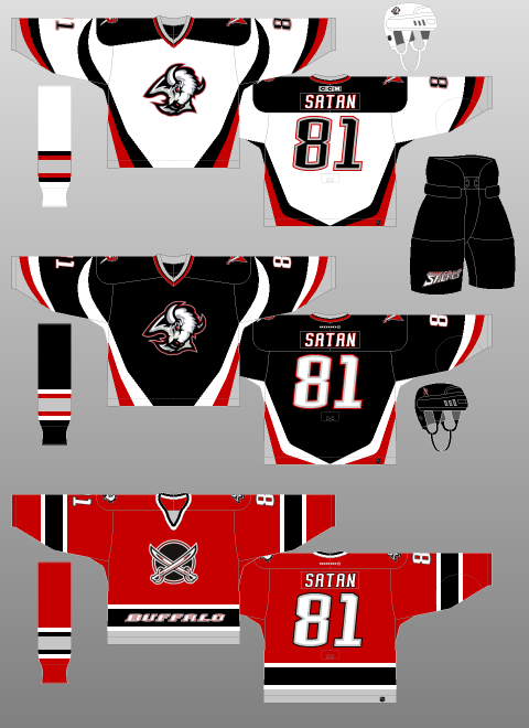 Even the 1996 redesign (which consisted of the black and white kits above; the red came a few years later) was pretty great. It gets a lot of flack for some reason, perhaps because it replaced such a classic set. However, given all of the garbage hanging in NHL locker room stalls during the ‘90s, the Sabres’ stab at modernisation turned out really well. Sharp, angled stripes on the jersey, along with the introduction of a secondary logo on the shoulder, make it pretty clear that the Sabres are indeed named after a pretty serious weapon. The central logo, a buffalo’s head, symbolises their fair city – or at least its name (I will confess, though: I had a poster of Hašek in my bedroom throughout my childhood. It was only in my early 20s that I realised that the mouth of the buffalo was on the right, and not the left). The late-coming third kit, including the red, “dinner plate” jerseys – that say “BUFFALO” on the waist striping, just in case you forgot who was playing and decided to check out some crotches to find out – were an ill-advised departure from the formula, to be sure. But, overall, these very-‘90s uniforms were – and still are – thoroughly enjoyable. One of the few attempts at modernisation that resulted in success. Enter the Buffaslug. 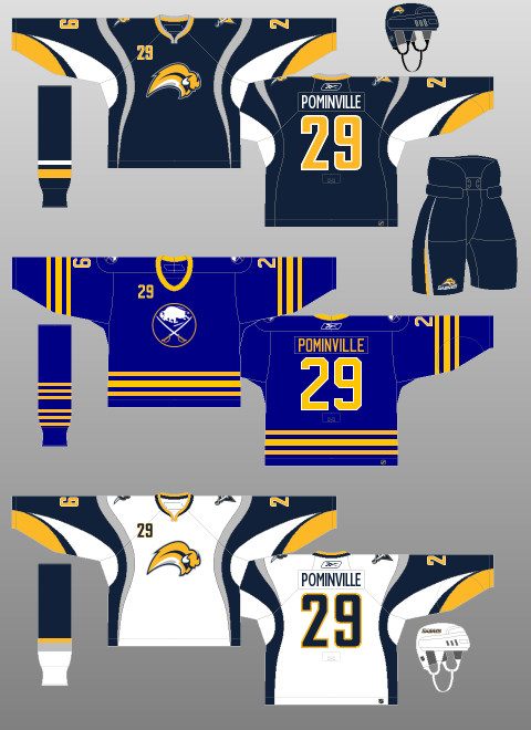 Oh…oh dear. A tiny, limbless, possibly demonic – check out those red eyes – buffalo flanked by a drab colour scheme – since when does the colour grey brighten up anyone’s day? – and psychedelic striping. Thankfully, the team threw their fans a bone with a throwback third jersey…which they promptly removed from their wardrobe the following season. The Buffaslug jersey is truly one of the most revolting articles of clothing the world has ever known. The following two kits followed the Buffaslug, with the Home and Away kits enduring to the present day. I included them purely to bring to the attention of the world that the middle jersey in each picture was actually worn by a professional hockey team, by players making millions of dollars. 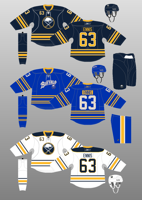 The first one puts some neat striping and accent variations on the Sabres’ original uniform sets…before making the logo the size of a dime and writing “BUFFALO” across the front in what looks like WordArt. I’m not a fan of script logos in general – why tell your fans what they already know? – but they are especially tacky when they dwarf the team’s original logo on the team’s original(-ish) backdrop. Yes, I know the script logo paid homage to the AHL’s Buffalo Bisons of the mid-20th Century, but did it really have to be front and centre? Why not pop it on the shoulder? The yellow nameplates contrast well with the royal blue of the jerseys, and the quilted numbers are kinda neat. I might even be able to get used to the 2 x 2 striping on the jerseys and socks. But the logo just ruins it for me. 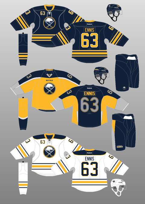 And the second one… Well, the Sabres’ own President, Ted Black, publicly stated after it was released that it might just be a “turd burger”. It looks like one of those paint-by-numbers pictures gone horribly awry, like someone whose friends have drawn on him/her after he/she passed out at a party. Millions of television sets found themselves prematurely discarded after hockey fans couldn’t understand why there was so much grey on their screens. Looking at it from the front (yellow) and back (blue), one would be hard-pressed to identify it as the same jersey. It looks like the wearing has donned a cape and is about to fly off into the night, perhaps to fight all of the Canadians coming across the border to clean out Buffalo’s malls. Oh but hey now, it’s not all bad: it says “BUFFALO” in tiny letters on the front. Just in case you forgot. I mean, how thoughtful is that?! 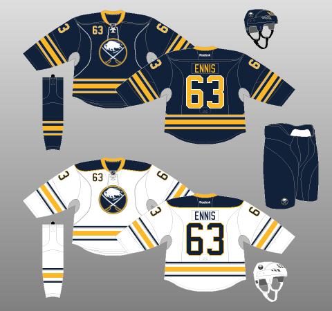 Which brings us to the present day. The Home kit was first introduced during the Buffaslug era as an alternate uniform. In 2010, it became their official Home uniform, while a white variation was added for the Away. The overall design is similar to that of their inaugural season, albeit with thicker striping on the jerseys and simplified striping on the socks – one batch of three stripes, instead of a Leafs-esque 3 x 3. The Sabres have chosen to stick with Reebok Edge ideals with the addition of “silver” (grey?) vertical piping on the sweaters. That said, this design choice is innocuous enough not to ruin the jerseys altogether. Equally odd are the player numbers on the top-left of the jersey (or the top-right if you’re wearing one right now). A holdover from the Buffaslug days, they break up the cleanliness of the look, though they are not particularly offensive to the eye.
The colour scheme retains the gold of the originals, but shifts from royal blue to navy. NHL teams have, generally, a pretty brutal history of creating dark-themed jerseys (Dallas, anyone? How about Anaheim? Buffalo, however, has pulled this one off rather nicely. The gold accents are bright and bold enough to offset the darkening, though a vertical gold stripe on the pants – and perhaps a gold shoulder outline on the Home jerseys, such as the accenting on Carolina’s old duds – would be welcome. Overall though, it is a pretty simple, relatively clean design. No shoulder logo? No problem. Buffalo has really done right by their fans and oh wait what was that… For the love of all things good and pure, STOP WITH THE GREY. And you put it under the arms (and neck), to boot! Now it just looks like your players are sweating all over the joint. Maybe that’s why your team doesn’t score, none of your players want to raise their arms! Since when does grey ever make anything better?! Sabres fans… I’m sorry. I’m just so sorry. All illustrations by Andrew M. Greenstein, The unofficial NHL Uniform Database …except the Winter Classic one. That one is an image from the Canadiens’ website. 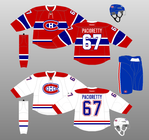 Having watched the Canadiens play the Bruins outdoors on New Year’s Day, and seeing as how I did the Boston Bruins last week, I thought it only fitting to write up Montréal’s team kit to complete the Winter Classic experience. The basic Home and Away kits for the Canadiens (see below – and above, for that matter) are, quite simply, as good as they get in the National Hockey League. For years, I struggled to pick between the Canadiens and the Chicago Blackhawks for the superior team uniform. However, this past summer, the Canadiens’ decision to replace the standard, V-Neck jersey collar with one of the lace-up variety – not to mention their gallicisation of the NHL shield – pushed it firmly into the top spot, for my money. Lace-up collars, especially for teams with as storied a past as the Canadiens, just make everything better. Take note, Chi-Town.  Yes, the colours and their combination are simple and not uncommon. And yes, the general design has been consistent for so long that it was pretty much predestined to become a classic anyway. However, two elements that really boost this uniform to legendary status are its logo and its striping. The logo is the famous elongated “C”, which is braced from within by an “H”, signifying Le Club de Hockey Canadien. And it looks brilliant. The striping is very unusual for a hockey sweater: on the Home jersey, a chunky thin-thick-thin combination wraps around the chest – unique among the current crop of NHL sweaters – with corresponding sleeve and sock accompaniments. A nice two-colour trim piece on the tail rounds out one of the most familiar jerseys in sports. And it looks brilliant. For the Road jersey, the two-colour tail striping carries over from the Home, with socks to match. Red cuffs and shoulder yokes fill in the perimeter of the Away jersey, rounding out another simple, recognisable creation. And it looks brilliant. My only real quibbles are with the separation between the numbers and their outlines on the Road jerseys, the lack of outlining on the player names, and the miniscule lettering for the captains. However, these are but petty trivialities. With the exception of a couple of tweaks to the logo, font and positioning of various elements, the Canadiens’ uniforms have remained largely the same since their first season in the National Hockey League, 1917-18. However, between 1909 and 1917, the Canadiens went through several uniform iterations. In 2008-09 (see left, below) and 2009-10 (see right, below), Montréal paid homage to some of these designs for the celebrations of their centennial year, along with, at the top left, the short-lived, yet sharp-looking, mid-1940s redesign of their white jerseys. 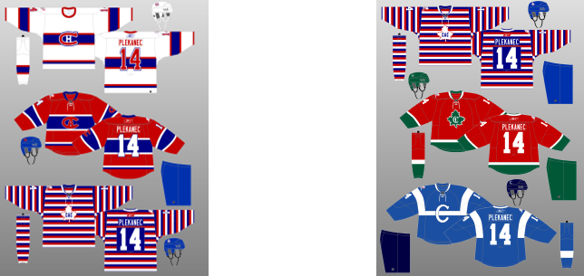 For a team that spent the first years of its existence searching for an identity – at least visually, it is admirable that the Canadiens have managed to stay consistent – and consistently brilliant – with their uniforms. Thus, the final, and perhaps most significant, element of their phenomenal kit is its longevity. The Canadiens’ uniforms have been as consistent and comforting as Tomas Plekanec’s turtleneck. The 2016 Winter Classic edition (see below) does not stray too far from the script. I love the vintage collar, bringing things back to the days when hockey sweaters were just that, woolen sweaters. The font is a little goofy and the sleeve numbers were clearly positioned by someone in need of an optometrist, but neither of these things prove disastrous to the product as a whole. 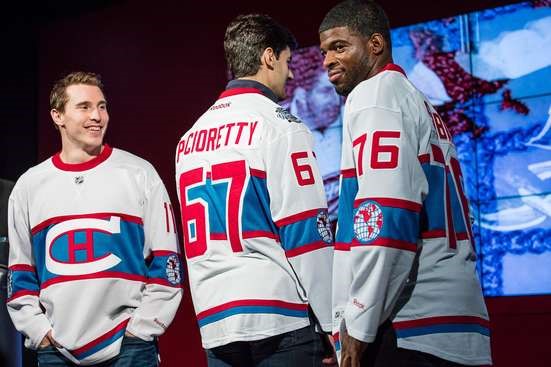 The base harkens back to the aforementioned mid-1940s redesign of the white jerseys – which were really just the reverse of the reds from the time period (both are shown below), with slightly paler blue and red colouring. 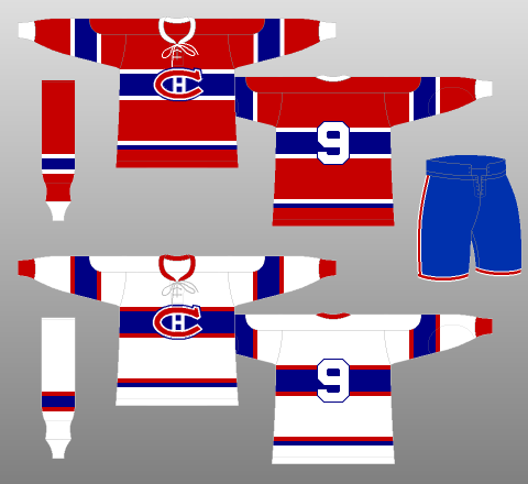 The central, white logo is straight off of the jerseys from the next image, which were worn from 1922 until 1924 – the first year the Canadiens won the Stanley Cup. 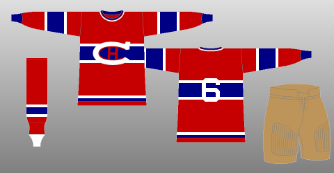 The sleeve striping of the Winter Classic jersey frames the Canadiens’ 1924-25 logo – sans the “Champions” label, which was designed to reflect their Stanley Cup Championship the season previous. 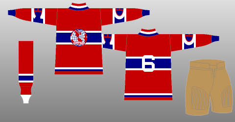 Unfortunately – or fortunately, depending on your perspective, the Habs elected not to bring back their brown pants for the occasion.
The Montréal Canadiens have the best goaltender in the world, in Carey Price. P.K. Subban is one of the best defencemen in the world. The Bell Centre is the largest hockey arena, by capacity, in the world. The Canadiens have the most Stanley Cup Championships of any team in the world. You can now slot them in as having the best jerseys, too. If there was a high school for sports franchises, the Habs would be the one who is super-smart AND super-attractive AND plays on all of the sports teams AND speaks 6 languages AND is Class President and Valedictorian, all while playing the guitar. And they wonder why everybody hates them. All illustrations by Andrew M. Greenstein, The unofficial NHL Uniform Database …except the last one. That one is from Chris Creamer’s SportsLogos.net 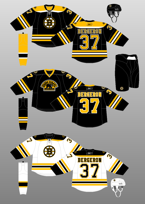 The Boston Bruins have had a weird few months. Come to think of it, they’ve had a pretty strange history. Every time they have a run of success and seemed poised to become a bona fide dynasty…circumstances occur to ensure that dream falls just a little bit short. Bobby Orr might well be the greatest player in National Hockey League history. However, injuries limited him to just 631 games – spread over ten seasons, in a Bruins uniform. Though they did win the Stanley Cup in 1970 and 1972, they were vastly overshadowed throughout the 1970s by the dynastic Montréal Canadiens. The Bruins also iced very good teams throughout the 1980s and early 1990s – making the Playoffs every year. But, they lost out each time, including four years in a row to the Canadiens – 1984 to 1987 – and twice, in the Stanley Cup Final, to the Edmonton Oilers – 1988 and 1990, the latter sans Wayne Gretzky. However, they managed to fleece the Vancouver Canucks for Cam Neely…and then watch his career be slowed and, ultimately, truncated by injury. The early 2000s saw a resurgence…followed by the lopsided trading of superstar captain Joe Thornton for his lack of production during the 2004 Playoffs – a broken rib isn’t a good excuse, apparently. Oh but it’s okay, they were bad enough to garner the 5th Overall Pick in 2006, using it to select Phil Kessel…a budding superstar who they then proceeded to trade in 2009. Oh but it’s okay, they rebounded and, in June of 2011, got themselves a Stanley Cup! But then their starting goaltender went crazy and they traded away budding superstar Tyler Seguin for being 21 years old. Oh but it’s okay, they made the Cup Final again in 2013, so everything’s fine for the future! But let’s trade away budding superstar Dougie Hamilton, just to be safe. Might as well get rid of prototypical Bruin Milan Lucic, too. Oh but it’s okay, now we have 3 First Round picks in 2015! It’s not like they’ll ALL fail their physicals, right?! …guys? What an interesting, interesting organisation. Their uniform history has been up and down, as well. Check out the mid-century versions below, with the striping that can’t make up its mind. The stripes on the jerseys are bad enough, but the socks look as though they let a 2 year-old have at the colour palette as if it were a game of Whac-A-Mole. Did they blow the entire design budget on three completely different jerseys, forcing them to make one pair of socks for the lot? Were they simply trying to distract everyone from whatever was going on with the tail striping? And since when are yellow pants ever a good idea? 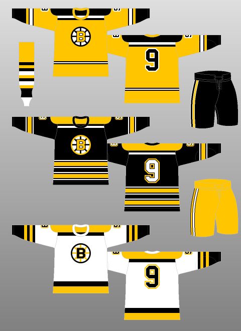 And, of course, everyone fondly recalls the 1990s, when the Bruins decided, “Hey, you know that awesome, Spoked-B logo we have? Let’s change it to Winnie The Pooh!” 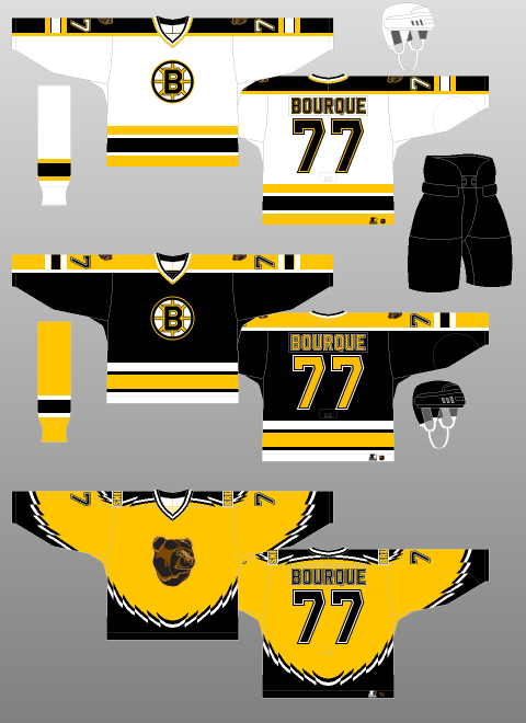 But hey, for a team with nearly a century of history behind it, one has to grant them a few duds. Thankfully, the current iteration isn’t too shabby.  Mercifully, the Bruins did not give into peer pressure with the advent of the Reebok Edge Uniform System and institute vertical striping under the arms. A simple three-stripe, two-colour combination graces the sleeves and tails of the home and away jerseys, with a lovely, two-tone shoulder yoke. The combination of these elements is gritty enough to satisfy the stereotypical, working-class image of Boston, while being artistically balanced enough to appease the eggheads in the surrounding suburbs. And the Spoked-B logo is, quite simply, one of the best of all time. Combine this with a simple helmet, pant and sock, and the Bruins have a real winner on their hands. Sort of. My only real beef is with the secondary logo. It draws inspiration from Boston’s very first emblem and, truth be told, is really not bad-looking thing at all. However, its presence on the shoulders of the Bruins’ home and away uniforms, breaks up what I like most about them: blockiness and simplicity. It just looks out of place. If the yokes were not there, the secondary logo would look less intrusive (though the jersey itself might be ruined), but the easiest solution would be to just get rid of it altogether. I would even be fine with it on a third jersey… …where it, surprise surprise, looks great! Actually, it is the best part of the third jersey. Where are the tail stripes? It looks like a practice uniform. And why do away with the lace-up collar? The thick, yellow one makes it look like the cheap, off-brand knock-off jerseys one finds at Canadian Tire or Walmart. This third jersey was clearly concocted for the purpose of making money. It is boring and cheap-looking, like it was designed on the back of a napkin at a breakfast joint by someone who forgot about the project until 23 minutes before it was due. But hey, they got a spot in the 2016 Winter Classic! Against Les Habitants, no less! And I hear they are going to go with a retro-themed kit! Finally, a suitable canvas for their alternate logo! 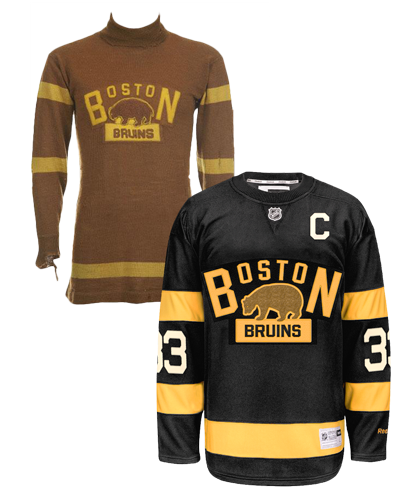 -___- …you had one job. Okay, so it’s not awful. I love the sweater-like collar. The striping is good. The big numbers that teams like to use for outdoor games have been made to look passable in this iteration – not an easy feat. And I especially like how, in going retro, these jerseys still retain the Bruins’ current black backdrop – brown is a tough colour to make work with any apparel, let alone that of a sports franchise. But…that logo… Come on. Seriously? It was wonky the first time, what with the big “B” and “N” flanking a much tinier “OSTO”. Why would you reuse it? And why, oh why, would you keep it brown?! Just use the alternate logo you already have! Or what about your 2010 Winter Classic jersey (see below), how about some variation of that? 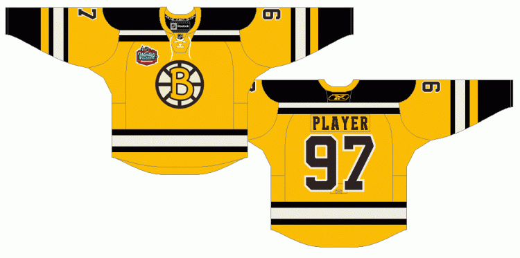 Oh wait, you blew that one, too! The fantastic yellow and black colour scheme is “complimented” by a brown logo outline and a cartoon, Comic Sans-esque “B”.
A team with this much history and that kind of passionate fanbase deserves a uniform kit to match. Stop screwin’ around and make this right. But please, feel free to keep on trading all of the players you draft in the First Round – that’s just good, wholesome entertainment for everyone. All illustrations by Andrew M. Greenstein, The unofficial NHL Uniform Database 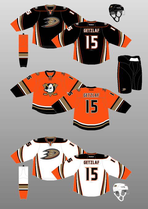 Apparently I never learned my ABCs and therefore put Arizona before Anaheim. Let’s just smooth over that and get right into it. The Anaheim Ducks have, by and large, been blessed when it comes to expansion teams in the National Hockey League. Stars like Paul Kariya and Teemu Selänne graced their roster – then composed of Mighty Ducks – early on. They made two Stanley Cup Finals in four seasons, taking the Devils to seven games in 2003 before winning it all in 2007. They have been one of the most dominant teams in the Western Conference for the past few years and, despite a rough start to this season, are expected to contend for the Cup yet again. However, they’ve never quite figured out the uniform side of things…until now. It all began with a colour scheme that resembled what one might expect to find in an Oompa Loompa’s vomit. Jade and eggplant were the dominant colours, though the aggressive-looking, disembodied, duck-shaped-hockey-mask-flanked-by-two-hockey-sticks logo was not bad at all. It retained enough of the cartoonishness of the team’s inspiration – the 1992 film, The Mighty Ducks, but also was an appropriate amount of aggressive for a hockey team. Even the jersey’s novel diagonal striping was simple and well-done. So, though the colour scheme was most definitely ill-advised, it wasn’t all bad. That is, until their third season when the so-called “Wild Wing” jersey made its debut… How they could expect grown adults to skate out in front of thousands of people – and compete with another team of grown adults – wearing THAT is beyond me. 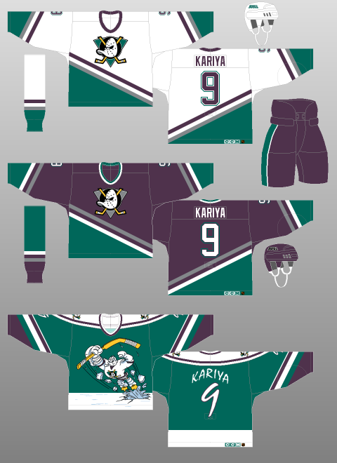 Since that unfortunate era, which produced one of the all-time, most universally-panned jerseys in league history (then again, it was the ‘90s. Be honest, what were YOU wearing?), the Ducks have tweaked their kit numerous times, giving us uniforms that were ugly… (see below) 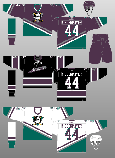 …and, despite a change in colour scheme and a Stanley Cup, boring. (again, see below) 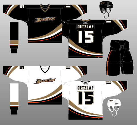 However, several years into the Reebok Edge uniform system, the Ducks finally changed their ways, giving fans a new Home and Away jersey, and, this season, a new third jersey. (see below for full kit)  And, this time, I have to say, I really think they’ve got it right. I’ve never been a huge fan of the Reebok Edge uniform system and the corresponding cacophony of alterations made to team kits, specifically with regards to altering tail striping to go along with Reebok Edge’s weird, unnatural, prescription for vertical striping (Colorado, anyone?). That said, if there is one jersey set on which it totally works, it is that of the Ducks. The sweeping, diagonal tail striping from their original – and Cup-winning – jerseys remains, but has been turned on its side for the Home and Away jerseys (mercifully, the sleeve striping remains intact). Also, orange has been input as a major component of the colour scheme, rather than just an accent. Even the (duck foot? duck in flight? maybe both?) logo is a marked improvement over the rather dull “Ducks” which graced the original redesign. The font is just ducky, as well – cheeky enough with flourishes to be interesting, but still legible and professional. That these complex jerseys are perfectly contrasted with plain black pants – save for a single, thin orange stripe – only strengthens my conviction that Anaheim has a balanced, sharp-looking uniform set. My only real qualms are that the main logo would function better as a secondary emblem and that the fake neck-tie reminds me of Hannibal Lecter’s mask.
Which brings us to their newly-minted third jersey. The original logo is back, this time set on a gold background. The ducky D logo is up on the shoulders. Combine that with an orange backdrop and traditional, horizontal striping and the Ducks have one of the finest pieces of jersey craftsmanship worn in the NHL today. It is simply phenomenal, and ranks up towards the top of my list of favourite jerseys, not just for this year, but for all time. It doesn’t have the history of a Montréal or a Chicago but, judged on aesthetic appeal alone, how can you keep it out of the top five? Come on, just look at it! It is bright and flashy without being annoying. It is complex without being busy. It is new-age without being offensive to tradition. What’s not to like? After several disappointing ends to otherwise great seasons, the Ducks should vie for a spot in the Stanley Cup Final this coming Spring. They’ve got a championship-calibre team to ice. They’ve now got championship-calibre jerseys to wear while doing it. |
Peter FerrellThis is a hockey blog. CategoriesArchives
September 2016
|
 RSS Feed
