|
All illustrations by Andrew M. Greenstein, The unofficial NHL Uniform Database 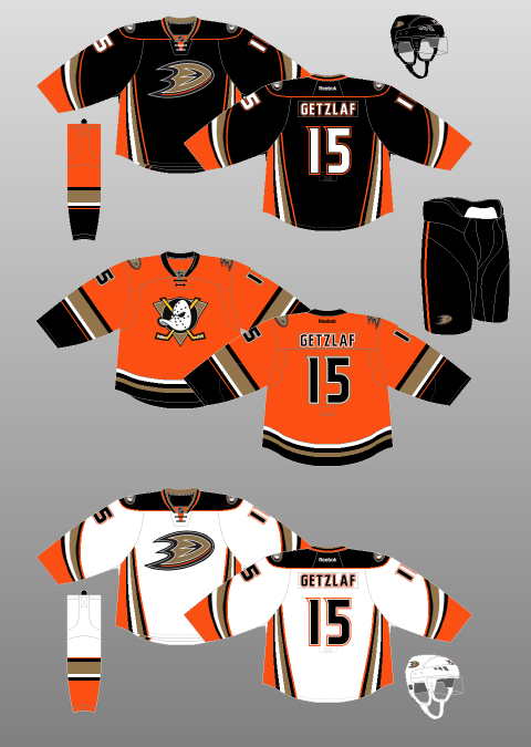 Apparently I never learned my ABCs and therefore put Arizona before Anaheim. Let’s just smooth over that and get right into it. The Anaheim Ducks have, by and large, been blessed when it comes to expansion teams in the National Hockey League. Stars like Paul Kariya and Teemu Selänne graced their roster – then composed of Mighty Ducks – early on. They made two Stanley Cup Finals in four seasons, taking the Devils to seven games in 2003 before winning it all in 2007. They have been one of the most dominant teams in the Western Conference for the past few years and, despite a rough start to this season, are expected to contend for the Cup yet again. However, they’ve never quite figured out the uniform side of things…until now. It all began with a colour scheme that resembled what one might expect to find in an Oompa Loompa’s vomit. Jade and eggplant were the dominant colours, though the aggressive-looking, disembodied, duck-shaped-hockey-mask-flanked-by-two-hockey-sticks logo was not bad at all. It retained enough of the cartoonishness of the team’s inspiration – the 1992 film, The Mighty Ducks, but also was an appropriate amount of aggressive for a hockey team. Even the jersey’s novel diagonal striping was simple and well-done. So, though the colour scheme was most definitely ill-advised, it wasn’t all bad. That is, until their third season when the so-called “Wild Wing” jersey made its debut… How they could expect grown adults to skate out in front of thousands of people – and compete with another team of grown adults – wearing THAT is beyond me. 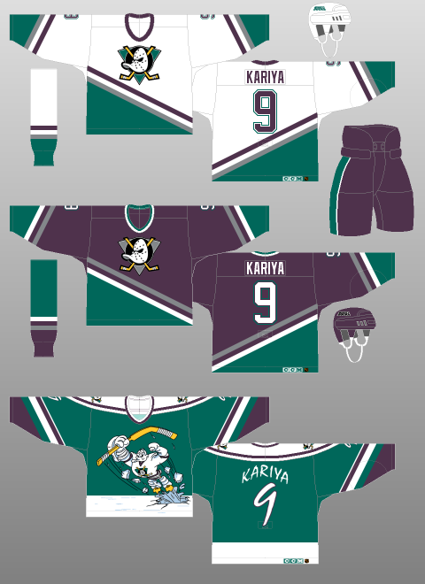 Since that unfortunate era, which produced one of the all-time, most universally-panned jerseys in league history (then again, it was the ‘90s. Be honest, what were YOU wearing?), the Ducks have tweaked their kit numerous times, giving us uniforms that were ugly… (see below) 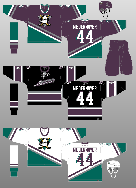 …and, despite a change in colour scheme and a Stanley Cup, boring. (again, see below) 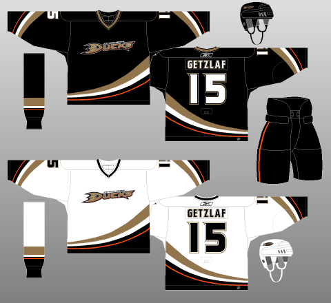 However, several years into the Reebok Edge uniform system, the Ducks finally changed their ways, giving fans a new Home and Away jersey, and, this season, a new third jersey. (see below for full kit)  And, this time, I have to say, I really think they’ve got it right. I’ve never been a huge fan of the Reebok Edge uniform system and the corresponding cacophony of alterations made to team kits, specifically with regards to altering tail striping to go along with Reebok Edge’s weird, unnatural, prescription for vertical striping (Colorado, anyone?). That said, if there is one jersey set on which it totally works, it is that of the Ducks. The sweeping, diagonal tail striping from their original – and Cup-winning – jerseys remains, but has been turned on its side for the Home and Away jerseys (mercifully, the sleeve striping remains intact). Also, orange has been input as a major component of the colour scheme, rather than just an accent. Even the (duck foot? duck in flight? maybe both?) logo is a marked improvement over the rather dull “Ducks” which graced the original redesign. The font is just ducky, as well – cheeky enough with flourishes to be interesting, but still legible and professional. That these complex jerseys are perfectly contrasted with plain black pants – save for a single, thin orange stripe – only strengthens my conviction that Anaheim has a balanced, sharp-looking uniform set. My only real qualms are that the main logo would function better as a secondary emblem and that the fake neck-tie reminds me of Hannibal Lecter’s mask.
Which brings us to their newly-minted third jersey. The original logo is back, this time set on a gold background. The ducky D logo is up on the shoulders. Combine that with an orange backdrop and traditional, horizontal striping and the Ducks have one of the finest pieces of jersey craftsmanship worn in the NHL today. It is simply phenomenal, and ranks up towards the top of my list of favourite jerseys, not just for this year, but for all time. It doesn’t have the history of a Montréal or a Chicago but, judged on aesthetic appeal alone, how can you keep it out of the top five? Come on, just look at it! It is bright and flashy without being annoying. It is complex without being busy. It is new-age without being offensive to tradition. What’s not to like? After several disappointing ends to otherwise great seasons, the Ducks should vie for a spot in the Stanley Cup Final this coming Spring. They’ve got a championship-calibre team to ice. They’ve now got championship-calibre jerseys to wear while doing it.
0 Comments
Leave a Reply. |
Peter FerrellThis is a hockey blog. CategoriesArchives
September 2016
|
 RSS Feed
