|
All illustrations by Andrew M. Greenstein, The unofficial NHL Uniform Database …except the Winter Classic one. That one is an image from the Canadiens’ website. 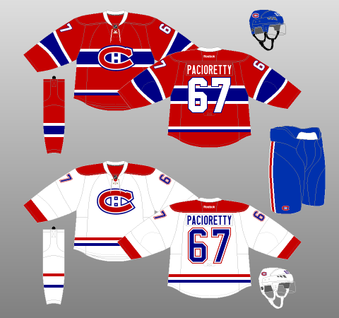 Having watched the Canadiens play the Bruins outdoors on New Year’s Day, and seeing as how I did the Boston Bruins last week, I thought it only fitting to write up Montréal’s team kit to complete the Winter Classic experience. The basic Home and Away kits for the Canadiens (see below – and above, for that matter) are, quite simply, as good as they get in the National Hockey League. For years, I struggled to pick between the Canadiens and the Chicago Blackhawks for the superior team uniform. However, this past summer, the Canadiens’ decision to replace the standard, V-Neck jersey collar with one of the lace-up variety – not to mention their gallicisation of the NHL shield – pushed it firmly into the top spot, for my money. Lace-up collars, especially for teams with as storied a past as the Canadiens, just make everything better. Take note, Chi-Town.  Yes, the colours and their combination are simple and not uncommon. And yes, the general design has been consistent for so long that it was pretty much predestined to become a classic anyway. However, two elements that really boost this uniform to legendary status are its logo and its striping. The logo is the famous elongated “C”, which is braced from within by an “H”, signifying Le Club de Hockey Canadien. And it looks brilliant. The striping is very unusual for a hockey sweater: on the Home jersey, a chunky thin-thick-thin combination wraps around the chest – unique among the current crop of NHL sweaters – with corresponding sleeve and sock accompaniments. A nice two-colour trim piece on the tail rounds out one of the most familiar jerseys in sports. And it looks brilliant. For the Road jersey, the two-colour tail striping carries over from the Home, with socks to match. Red cuffs and shoulder yokes fill in the perimeter of the Away jersey, rounding out another simple, recognisable creation. And it looks brilliant. My only real quibbles are with the separation between the numbers and their outlines on the Road jerseys, the lack of outlining on the player names, and the miniscule lettering for the captains. However, these are but petty trivialities. With the exception of a couple of tweaks to the logo, font and positioning of various elements, the Canadiens’ uniforms have remained largely the same since their first season in the National Hockey League, 1917-18. However, between 1909 and 1917, the Canadiens went through several uniform iterations. In 2008-09 (see left, below) and 2009-10 (see right, below), Montréal paid homage to some of these designs for the celebrations of their centennial year, along with, at the top left, the short-lived, yet sharp-looking, mid-1940s redesign of their white jerseys. 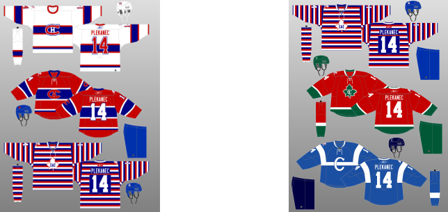 For a team that spent the first years of its existence searching for an identity – at least visually, it is admirable that the Canadiens have managed to stay consistent – and consistently brilliant – with their uniforms. Thus, the final, and perhaps most significant, element of their phenomenal kit is its longevity. The Canadiens’ uniforms have been as consistent and comforting as Tomas Plekanec’s turtleneck. The 2016 Winter Classic edition (see below) does not stray too far from the script. I love the vintage collar, bringing things back to the days when hockey sweaters were just that, woolen sweaters. The font is a little goofy and the sleeve numbers were clearly positioned by someone in need of an optometrist, but neither of these things prove disastrous to the product as a whole. 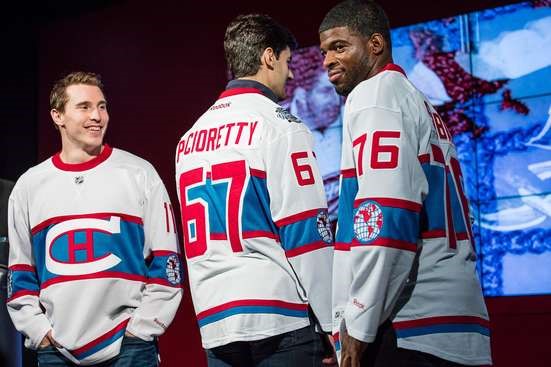 The base harkens back to the aforementioned mid-1940s redesign of the white jerseys – which were really just the reverse of the reds from the time period (both are shown below), with slightly paler blue and red colouring. 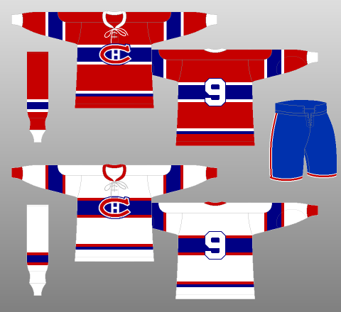 The central, white logo is straight off of the jerseys from the next image, which were worn from 1922 until 1924 – the first year the Canadiens won the Stanley Cup. 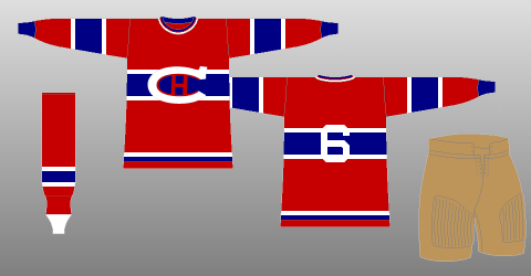 The sleeve striping of the Winter Classic jersey frames the Canadiens’ 1924-25 logo – sans the “Champions” label, which was designed to reflect their Stanley Cup Championship the season previous. 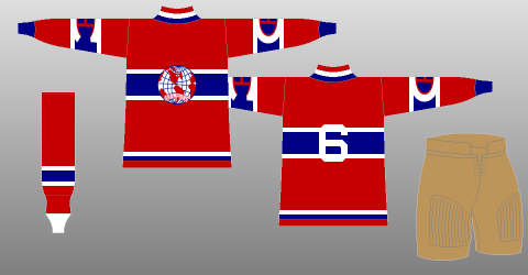 Unfortunately – or fortunately, depending on your perspective, the Habs elected not to bring back their brown pants for the occasion.
The Montréal Canadiens have the best goaltender in the world, in Carey Price. P.K. Subban is one of the best defencemen in the world. The Bell Centre is the largest hockey arena, by capacity, in the world. The Canadiens have the most Stanley Cup Championships of any team in the world. You can now slot them in as having the best jerseys, too. If there was a high school for sports franchises, the Habs would be the one who is super-smart AND super-attractive AND plays on all of the sports teams AND speaks 6 languages AND is Class President and Valedictorian, all while playing the guitar. And they wonder why everybody hates them.
0 Comments
Leave a Reply. |
Peter FerrellThis is a hockey blog. CategoriesArchives
September 2016
|
 RSS Feed
