|
All illustrations by Andrew M. Greenstein, The unofficial NHL Uniform Database 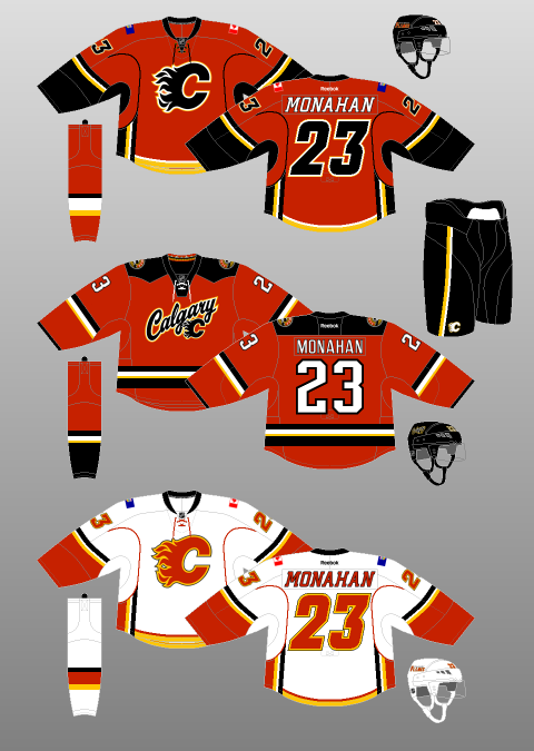 Ahhh yes, the Calgary Flames. My hometown team. My boys! The perennial feel-good, hard-working, grab-your-lunch-pail-and-work-boots-and-go-to-work team…that has also won only 4 playoff rounds since 1989, missing the playoffs altogether 13 times during that span. Well, hey, at least they don’t consistently keep trading my favourite players though, right?! I’m so happy Theo Fleury spent his entire caree–…I mean, isn’t it wonderful that Valeri Bure got to retire as a Fl–…you’ve gotta be kidding me, what about Freddie Brathwaite? ...well, SURELY Jarome Iginla won’t be trad–OH COME ON. Fuck it. At least they have nice jerseys. OH WAIT. But, for now, let’s head back to happier times, where it all began: 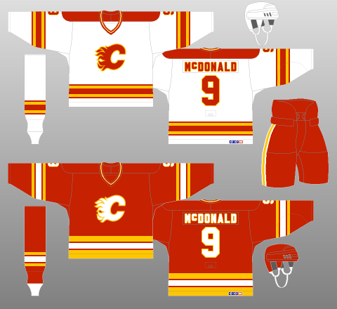 Yes, the ‘80s. Fresh off a move from Atlanta, the Flames were kicking ass and taking names. Or, rather, providing a mild divisional annoyance to the Edmonton Oilers during the latter team’s march to 64 Cups in the decade. Nevertheless, they looked sharp doing it, with a simple, three-colour design – extracted from Lanny McDonald’s glorious moustache – that was bright enough to belong in the 1980s, yet timeless enough to be brought back as a throwback in 2009 – 20 years after their lone Stanley Cup win. However, after experiencing four first-round exits in five years – the other year being one in which they failed to qualify for the Playoffs at all, it was clear that something needed to be done. Of course, what shakes a team up more than new jerseys, amirite?! 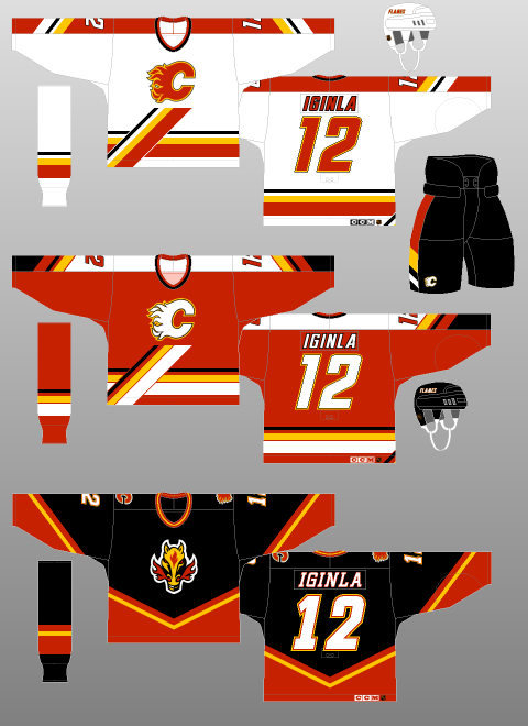 Well, to be brutally honest, it didn’t work. I feel like trading away superstar – and Stanley Cup winning goal-scorer – Doug Gilmour for…well, not Doug Gilmour might also have had something to do with that. The Flames would not win a Playoff round until 2004 – wearing another kit, I might add. However, this 1994 effort at redesigning the Home and Away uniforms – which were joined by a black Alternate kit in 1998 – wasn’t too shabby, especially considering some of the garbage being spewed out by other teams of the era. The addition of black was done tastefully to the Home and Away jerseys, and the diagonal platform that the logo rests upon – along with corresponding trim on the jersey sleeves and pants – is interesting and breaks up what would otherwise be a pretty, yet dull, concoction. The black, “Flaming Horse” jersey took a lot of heat (see what I did there?!), especially when they usurped the red jerseys as Calgary’s Away uniforms in the next redesign, but I didn’t mind it – Calgary IS the “Stampede City”, after all – though the white fill for the numbers and font probably should have been red. At the very least, the logo was well-suited to the secondary status it enjoyed in the next iteration of the Flames’ duds. One final point is the fact that, in one of the best uniform-related decisions in NHL history, the Flames Alternate Captains, instead of the traditional “A” on their jerseys, had the stylised “A” logo of Calgary’s predecessors, the Atlanta Flames, on their chests. How cool is that! They even briefly tried their primary logo as the patch for the Captain, but that change did not last. 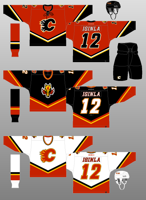 The white jersey you see above was introduced to start the 2000-01 season, while the red one was added in 2003 – when the NHL switched back to having dark-coloured Home and light-coloured Away jerseys. Both follow the template of the “Flaming Horse” jersey, with said logo relegated to secondary status on the shoulder. As neat as it is, the Flames’ actual logo is dope. Why they didn’t just put their primary logo on the black jersey is beyond me. But I digress. The black crest on the red jersey was a first for the team and still looks phenomenal today. Not that the white Flaming C was bad, but the black just looks a little bit more menacing. Plus, they went to Game Seven of the Stanley Cup Final with these jerseys (although they probably should have been awarded the Cup in Game Six. Here’s a video of it. Not that I’m bitter or anything.) They even added a lace-up neck! Ticks all my boxes, this one. Which brings us to the present day. Oh…oh dear.  Introduced for the 2007-08 season, the Reebok Edge uniform system, with its unfinished sleeve striping, emphasis on vertical patterns over the horizontal, and weird fixation on figure-hugging vertical piping made a mockery of many a beautiful jersey. And then there was the scandal where Reebok flat-out forgot to design the Maple Leafs a uniform at all, leaving them with nothing to wear but practice jerseys.
But perhaps no team was so dearly affected by this mass redesign than the Calgary Flames. Weird, incomplete sleeve stripes. Weird, incomplete underarm stripes. Weird, incomplete piping that leads to nowhere, A weird, horizontal tail stripe that intersects with the vertical underarm striping like it was designed in Microsoft Paint. Et la pièce de résistance? The flag of Alberta on one shoulder, with the flag of Canada on the other. Just in case you forgot where Calgary was. At least the Canadian flag blends in; the Alberta flag’s blue background contrasts completely with the team’s colour scheme. It looks like one of those crafts from elementary school that you had to make by sticking bits of recycling together. In 2013, the dumpster fire burned on with the introduction of a new Alternate kit, seen in the middle of the above image. A tiny collegiate-like script, complimented by a tiny Flames logo is the primary crest. The secondary logo is too complicated for its own good, not to mention the fact that the “F” of the “CF” mark points directly into the ground. Logos are supposed to be something that a kid can draw in school. Not that have to be explained to them by their parents. Perhaps even more bizarrely, the round secondary logo and the curvy, rounded primary crest(s?) contrast sharply with the squared-off shoulder yokes, and squared-off, incomplete striping. What a mess. Other than the brief blip in 2004, following this team has been one disappointment after another. Yes, yes, there was the Spring of 2015. But, in our heart of hearts, we Flames fans knew that our team was playing way above its heads – not to mention way above the Law of Averages. That said, after many years in the wilderness, the Flames appear to finally be on the rebound. Now we we wait for the day that they get a jersey that we can wear in public without being arrested for indecent exposure.
0 Comments
Leave a Reply. |
Peter FerrellThis is a hockey blog. CategoriesArchives
September 2016
|
 RSS Feed
